CIRERETA
Cirereta is a range of cherry products created for Casa Carmen, one of the oldest local shops in Alpatró (Alicante, Spain). A small, familiar place built on proximity and trust, the kind of shop that has always been part of everyday life in the village.
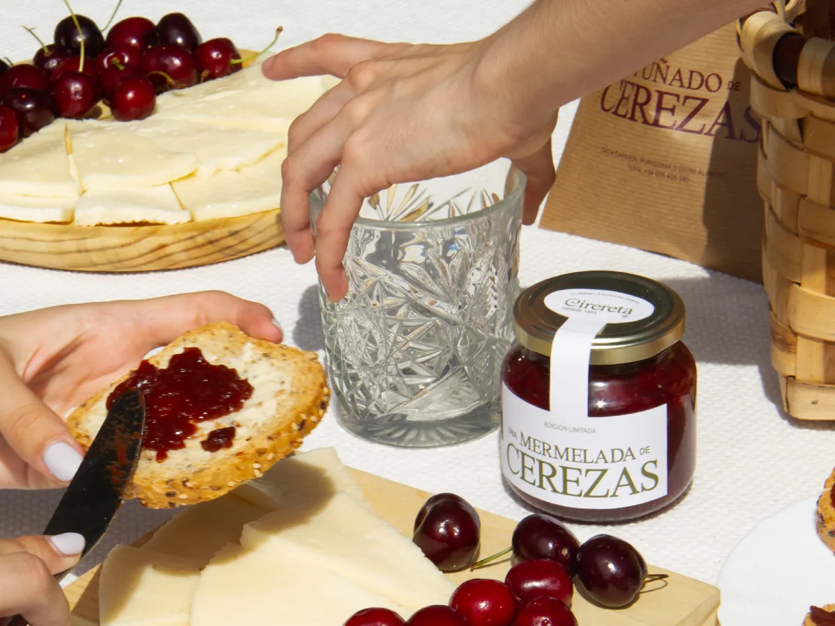
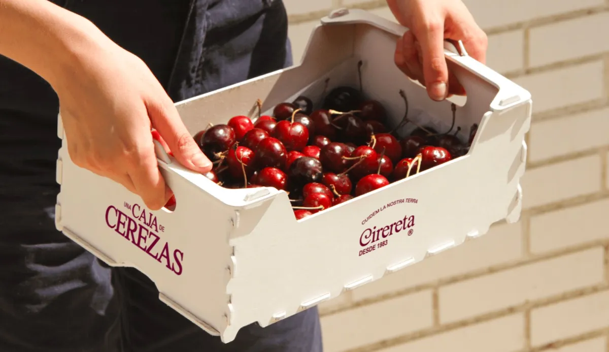
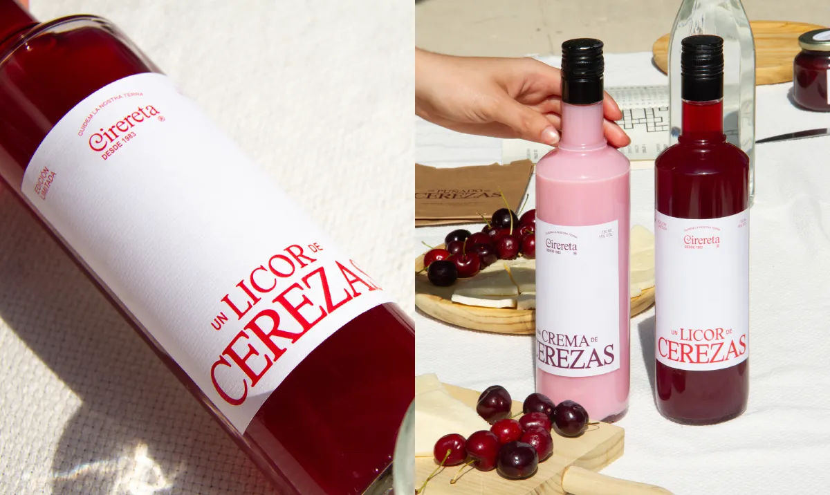
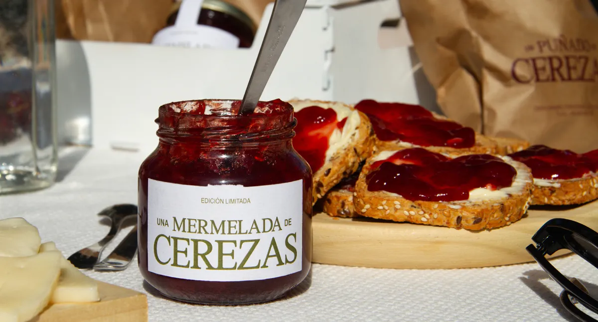
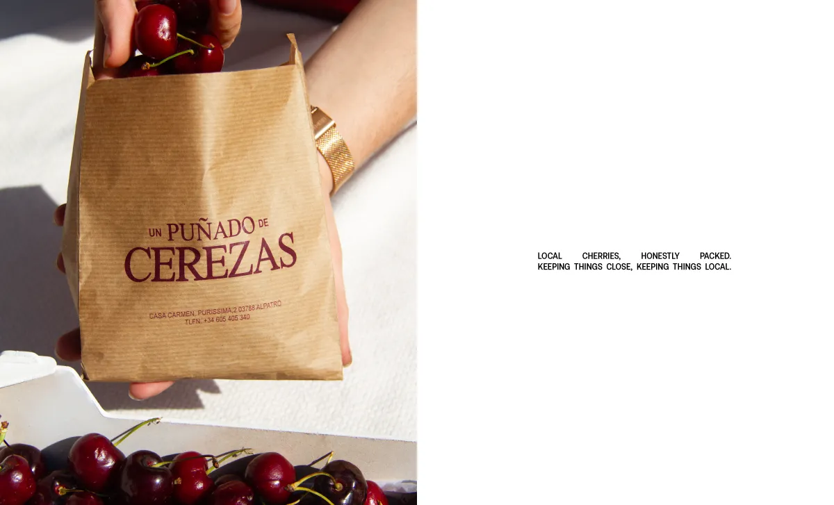
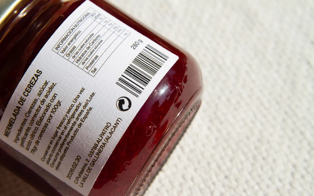
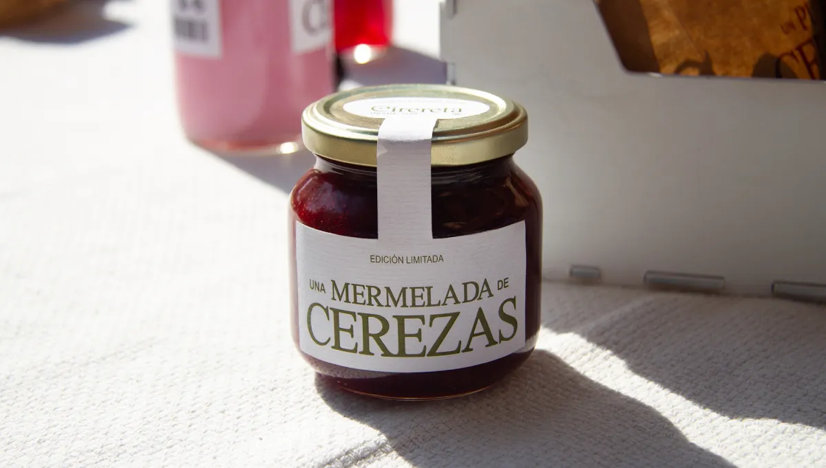
The rebranding takes this honesty as its starting point. Instead of dressing the products up with unnecessary language, each one is simply named for what it is: a handful of cherries, a cherry jam, a cherry liqueur. This straightforward way of speaking becomes the common thread across the entire range and one of the most recognisable elements of the identity.
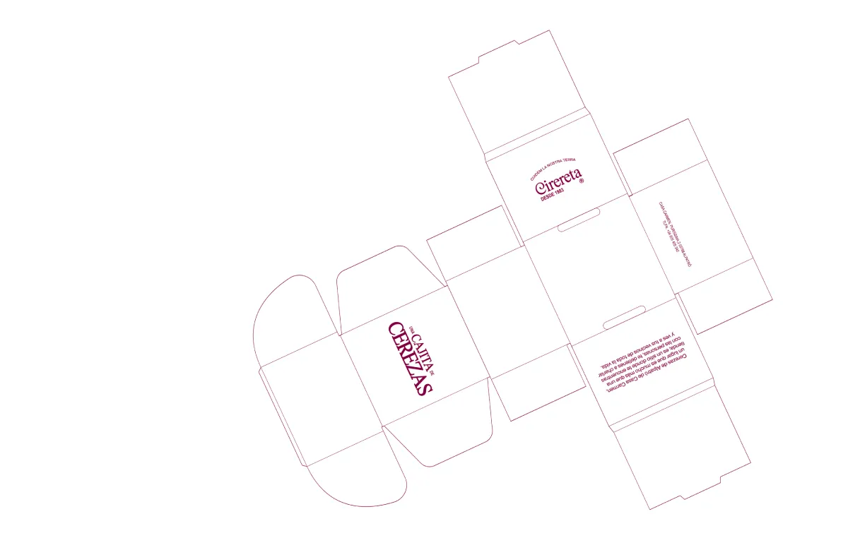
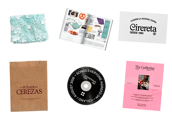
Visually, the project brings the character of traditional local shops into a contemporary context. Typography, packaging, photography and art direction come together to create a system that feels simple, familiar and rooted in its place of origin, while giving Cirereta a distinctive identity of its own.
At its core, Cirereta is a celebration of what is close to us. A project about local production, KM0 consumption and the value of the shops and people that have been part of a community for generations.
Created in collaboration with Irene Agulló, Laura van Wegen and Sofía Korobkoff.
Year: 2024
Client: Casa Carmen
Sector: Food & Beverage
Art direction – Branding – Creative direction – Identity – Packaging design – Photography – Strategic design